Vent
Vent
Vent
Vent
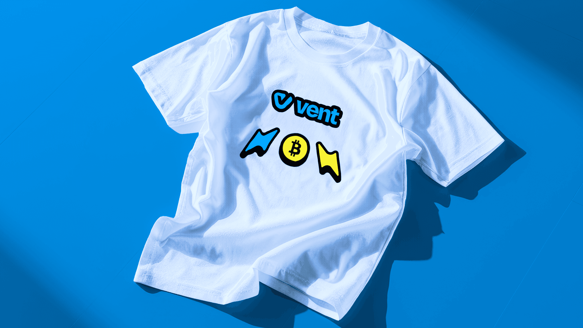
Vent Africa makes crypto-to-cash transactions fast and easy across Africa. As the platform grew, its brand got a refresh, cleaner fonts, better colors, and a more consistent look overall. The updated identity feels more modern and trustworthy, helping the brand connect better with its users and stand out in the fintech space.
Vent Africa makes crypto-to-cash transactions fast and easy across Africa. As the platform grew, its brand got a refresh, cleaner fonts, better colors, and a more consistent look overall. The updated identity feels more modern and trustworthy, helping the brand connect better with its users and stand out in the fintech space.
Vent Africa makes crypto-to-cash transactions fast and easy across Africa. As the platform grew, its brand got a refresh, cleaner fonts, better colors, and a more consistent look overall. The updated identity feels more modern and trustworthy, helping the brand connect better with its users and stand out in the fintech space.
Expertise
Expertise
Expertise
Brand Refresh, Brand Guidelines
Brand Refresh, Brand Guidelines
Location
Location
Location
Nigeria
Nigeria
Nigeria
Industry
Industry
Industry
Crypto
Crypto
Crypto
Link
Link
Link
vent.africa
Date
Date
Date
2025
2025
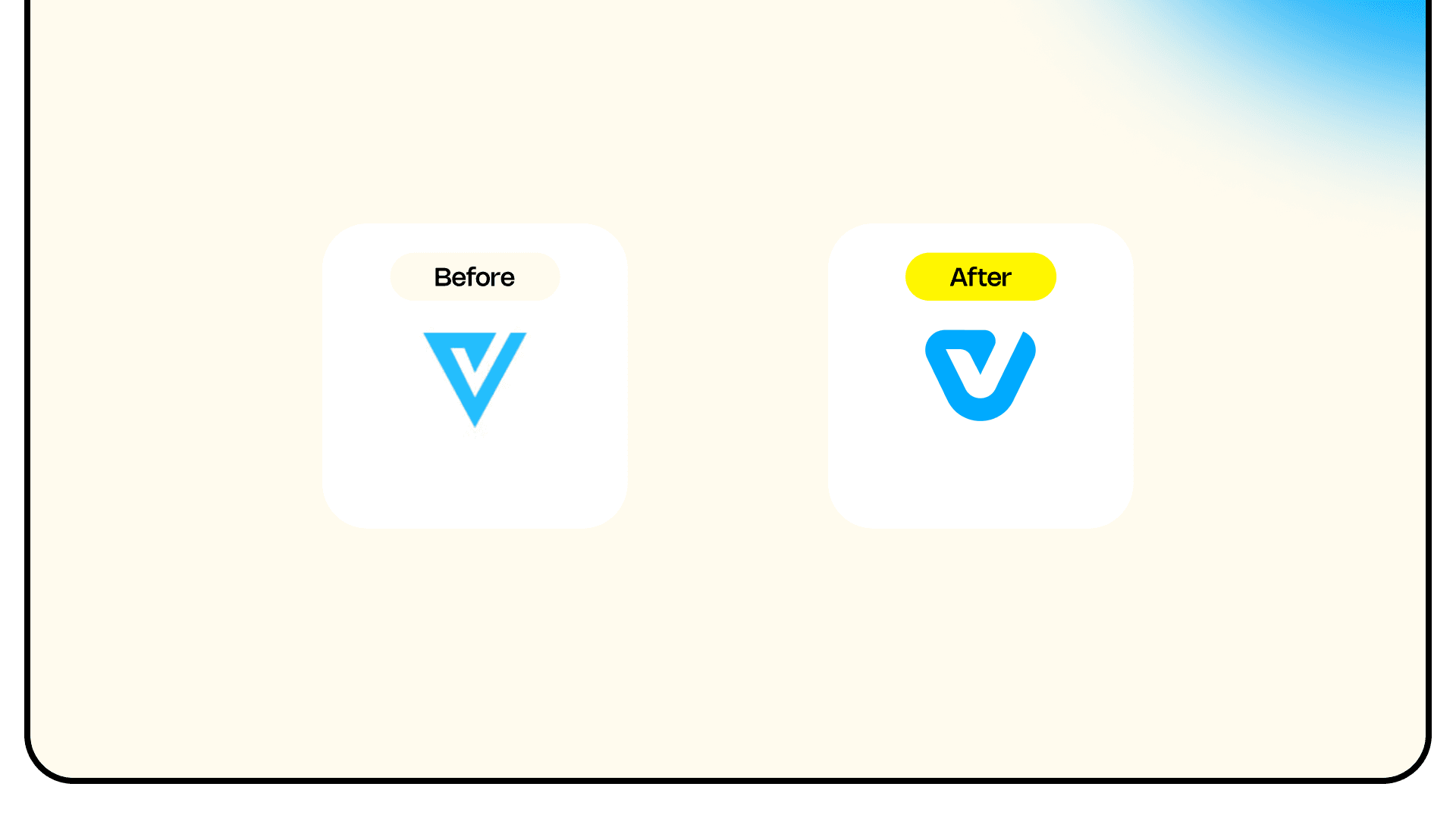
Finding the Gaps & Defining the Look
Finding the Gaps & Defining the Look
Finding the Gaps & Defining the Look
The process started with a deep dive into Vent Africa’s existing brand assets—logo, typography, color palette, marketing materials, and social media presence. The goal was to identify inconsistencies and areas where the brand felt dated or misaligned with its core promise of speed, ease, and accessibility. Rather than a full rebrand, the approach was to preserve the brand’s existing equity while enhancing its clarity and professionalism. A refined visual direction was developed—one that kept the brand recognizable but gave it a more modern, trustworthy feel to support its growth in the competitive fintech space.
The process started with a deep dive into Vent Africa’s existing brand assets—logo, typography, color palette, marketing materials, and social media presence. The goal was to identify inconsistencies and areas where the brand felt dated or misaligned with its core promise of speed, ease, and accessibility. Rather than a full rebrand, the approach was to preserve the brand’s existing equity while enhancing its clarity and professionalism. A refined visual direction was developed—one that kept the brand recognizable but gave it a more modern, trustworthy feel to support its growth in the competitive fintech space.
The process started with a deep dive into Vent Africa’s existing brand assets—logo, typography, color palette, marketing materials, and social media presence. The goal was to identify inconsistencies and areas where the brand felt dated or misaligned with its core promise of speed, ease, and accessibility. Rather than a full rebrand, the approach was to preserve the brand’s existing equity while enhancing its clarity and professionalism. A refined visual direction was developed—one that kept the brand recognizable but gave it a more modern, trustworthy feel to support its growth in the competitive fintech space.

Refining the Details That Matter
Refining the Details That Matter
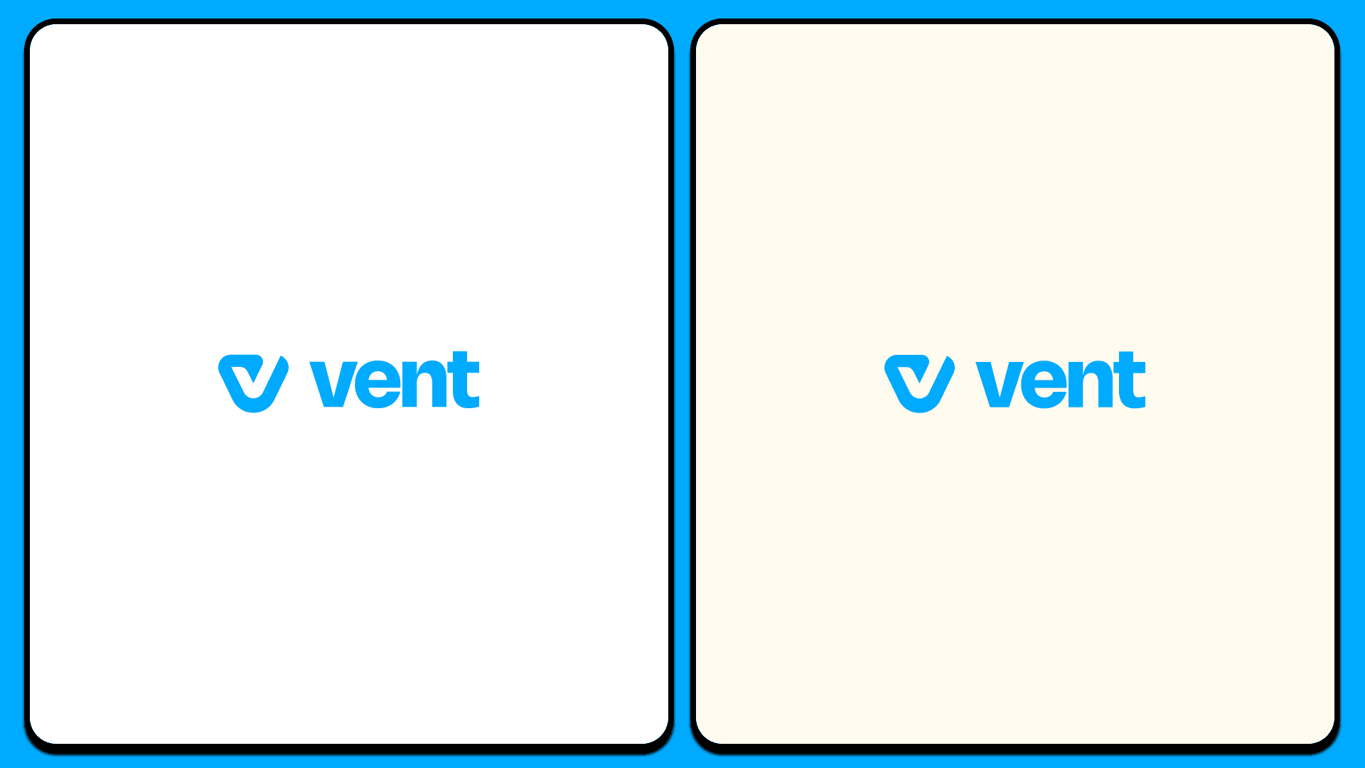
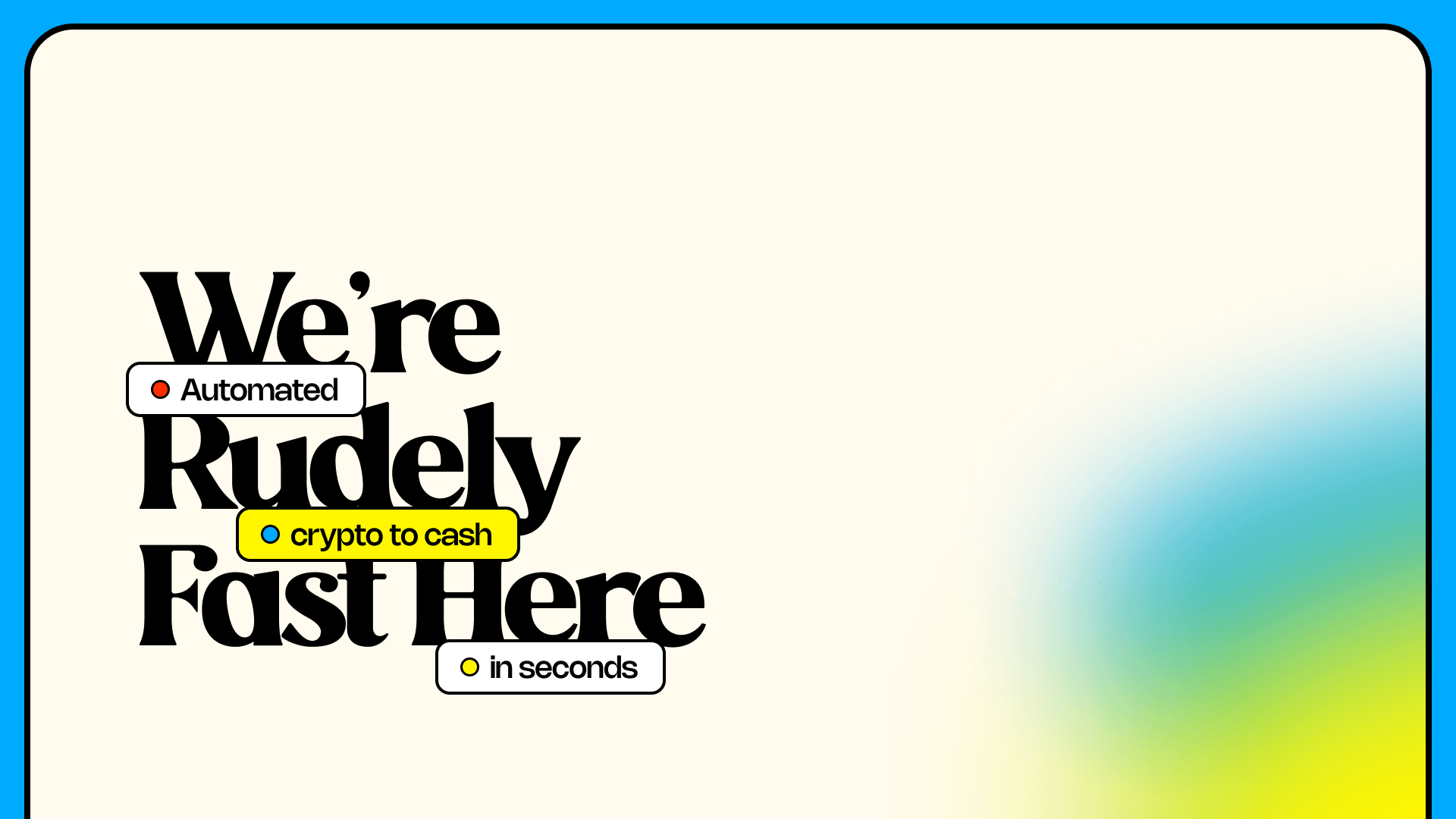
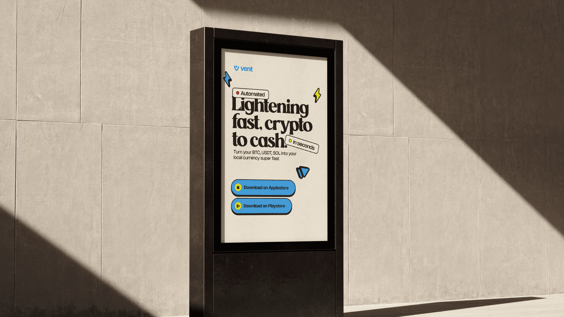
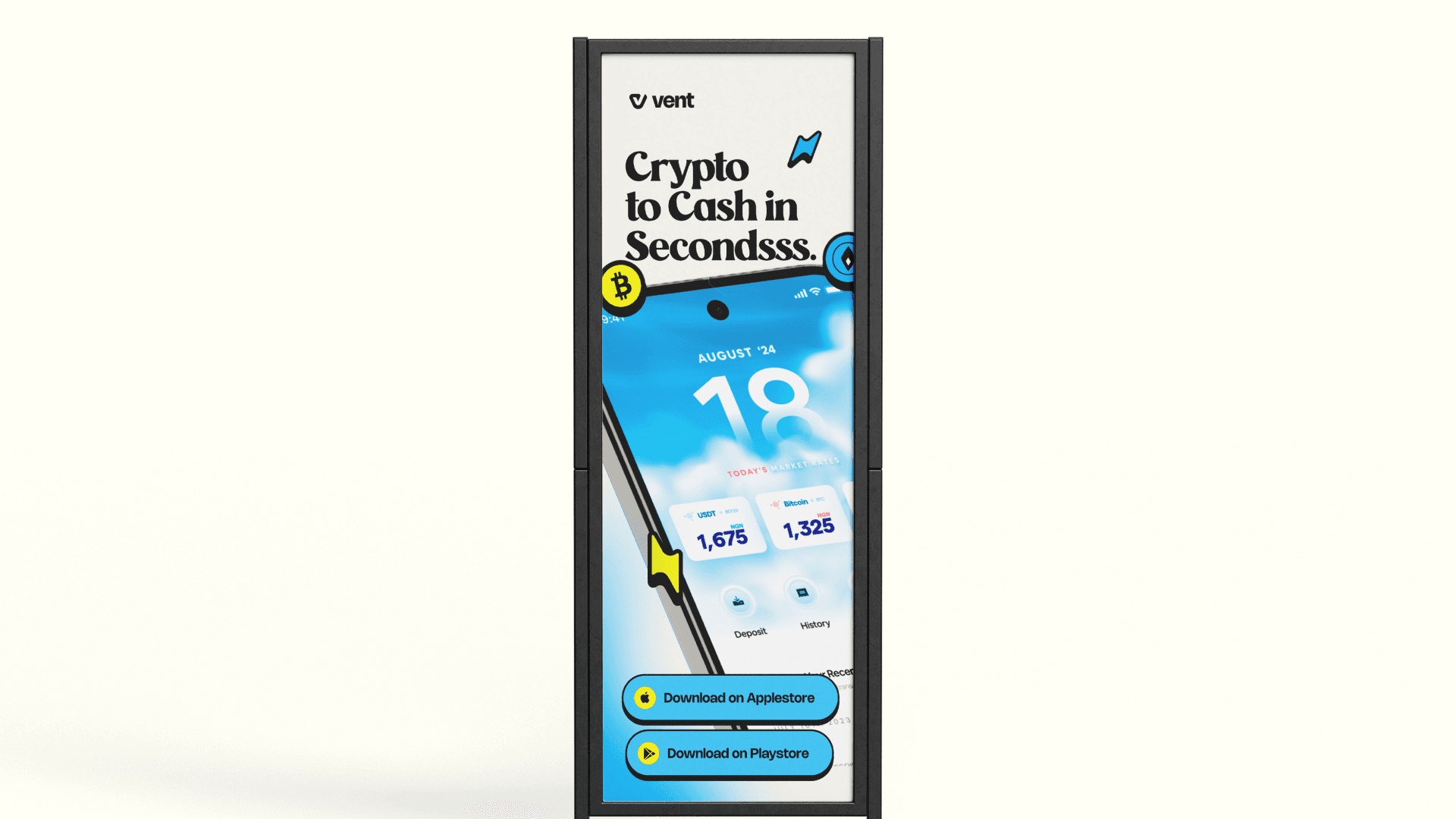
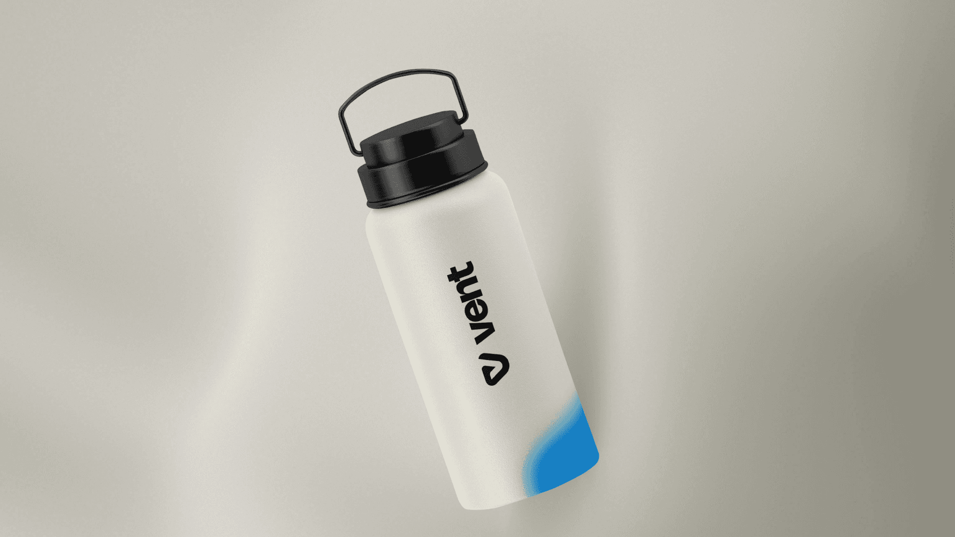
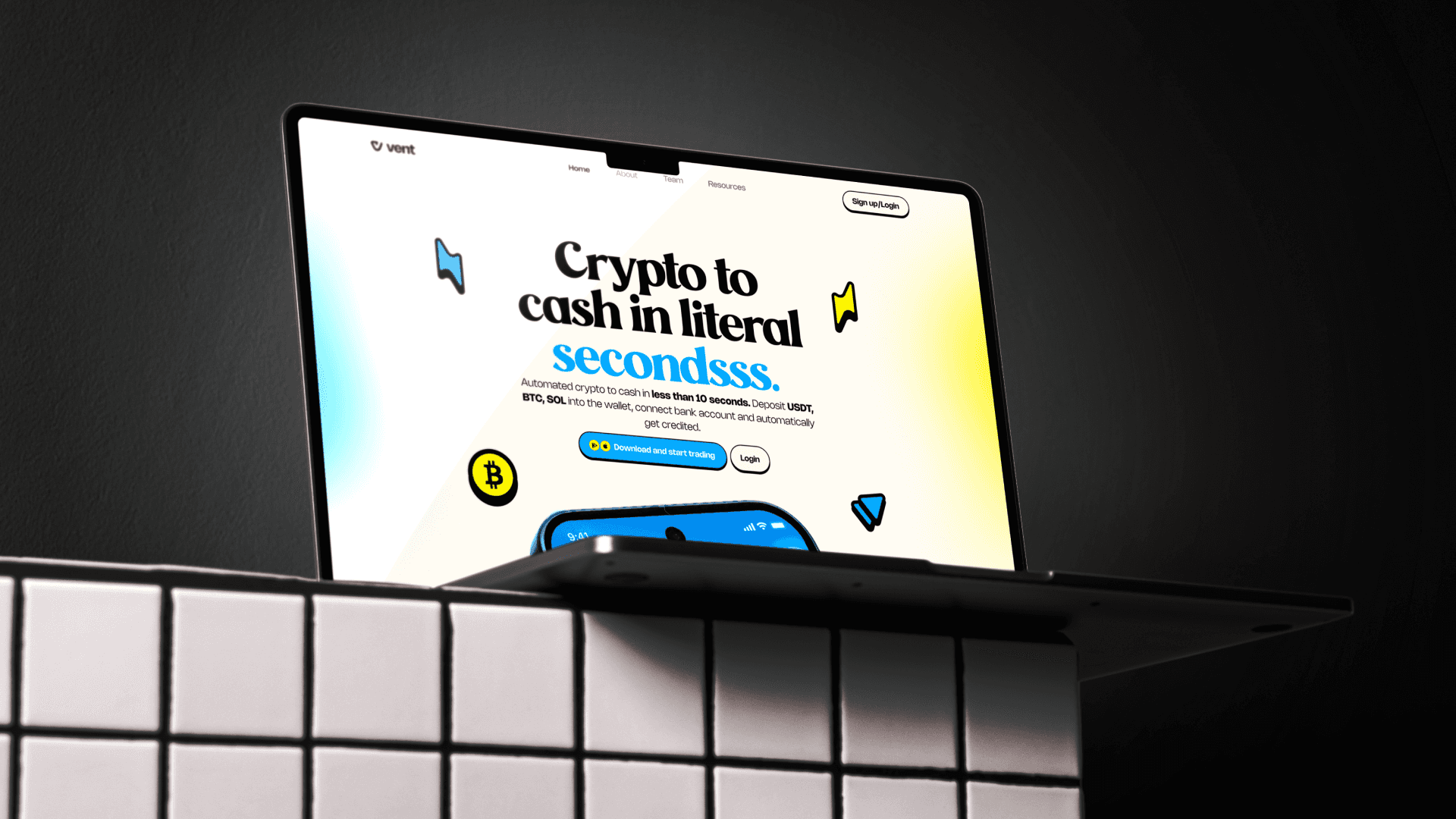
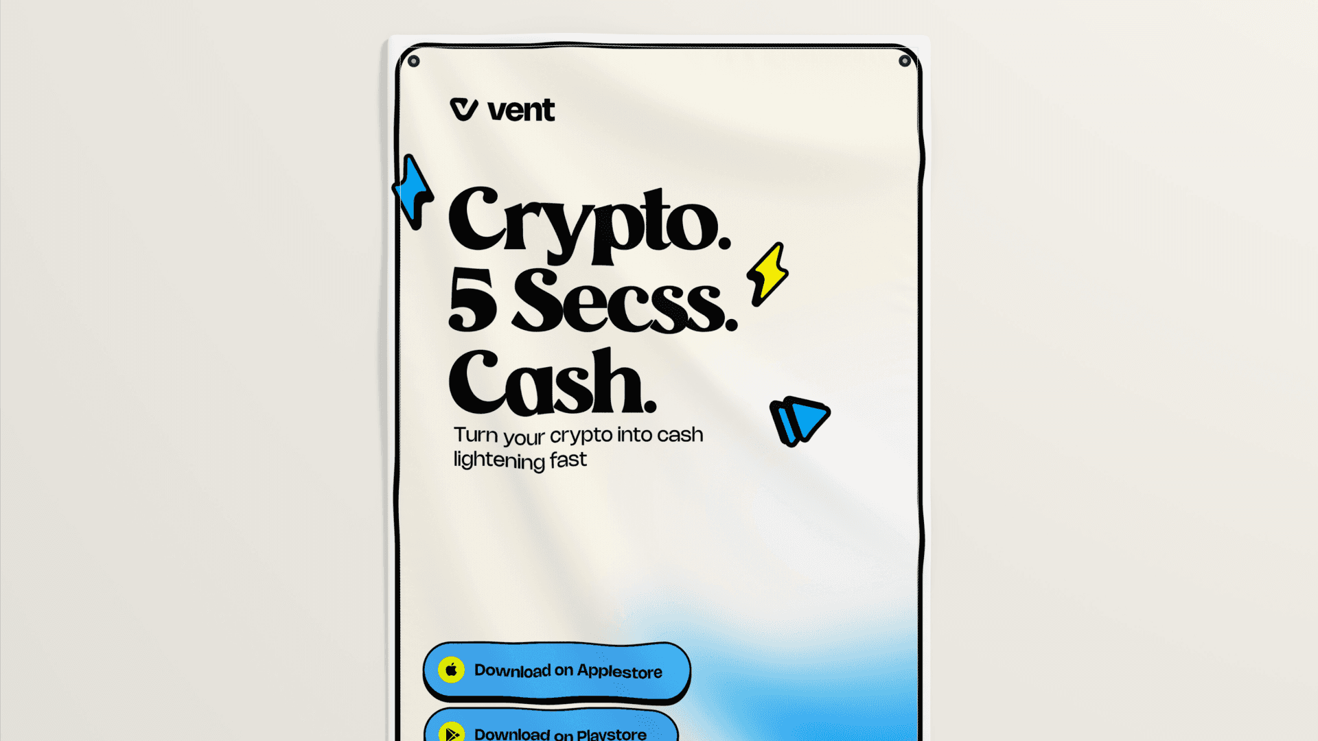
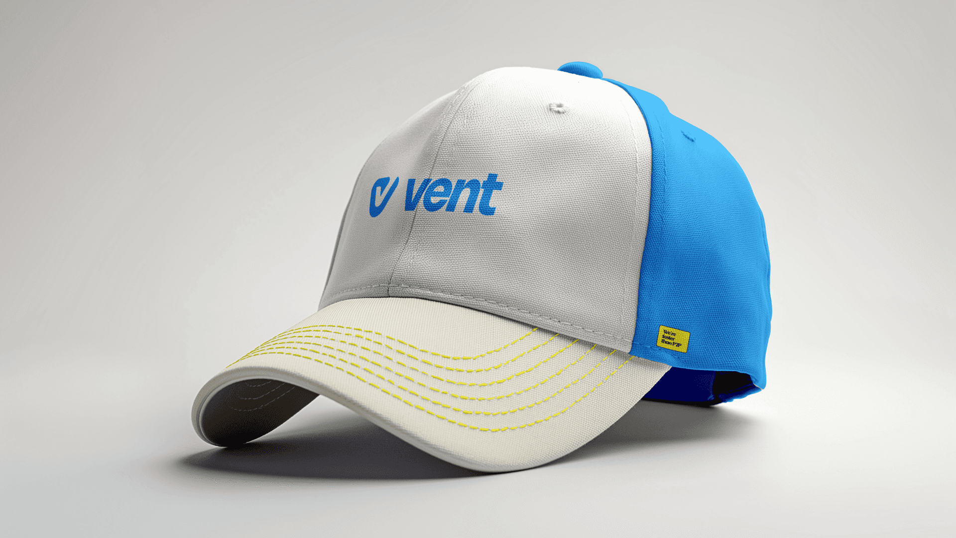
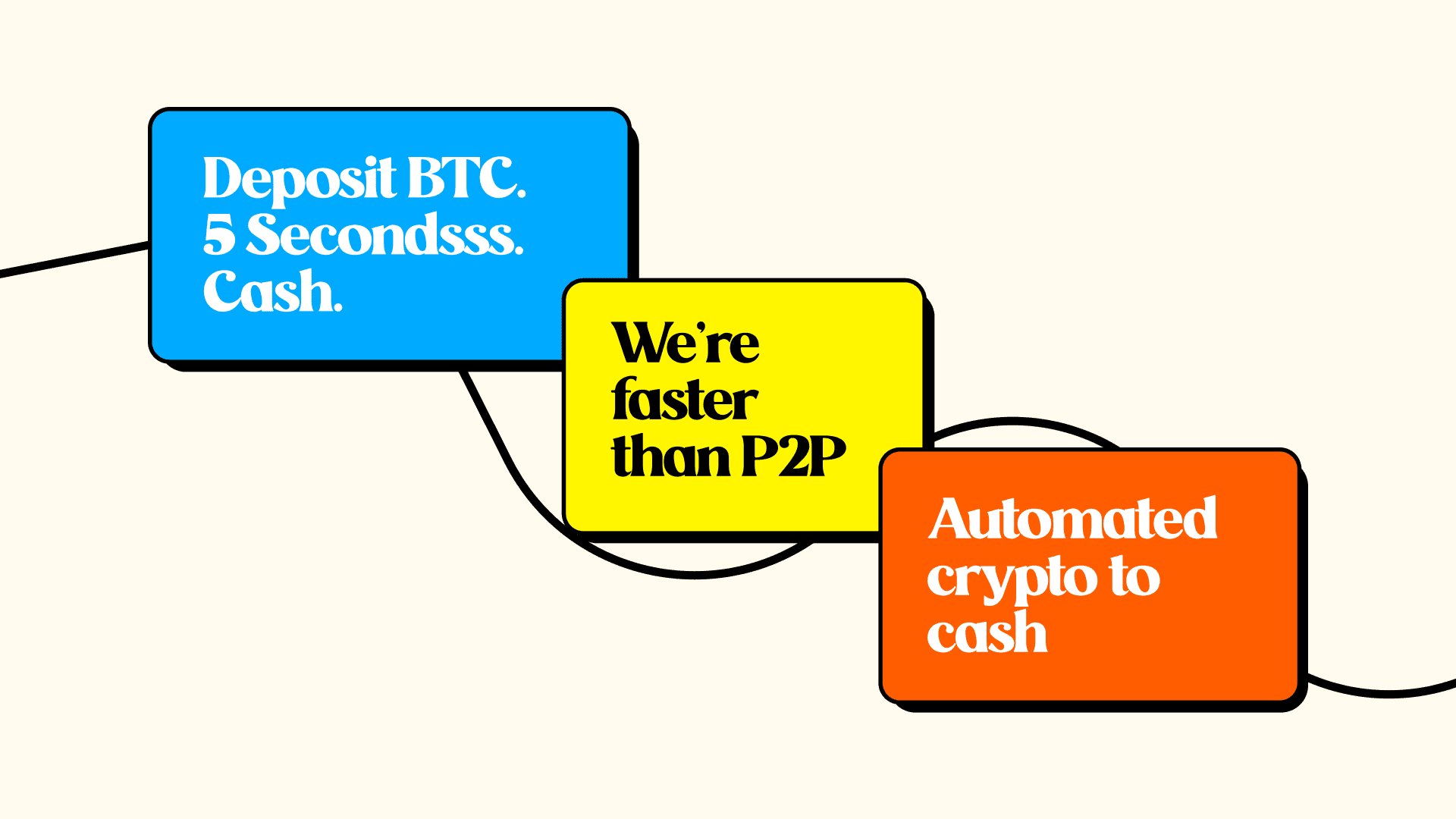
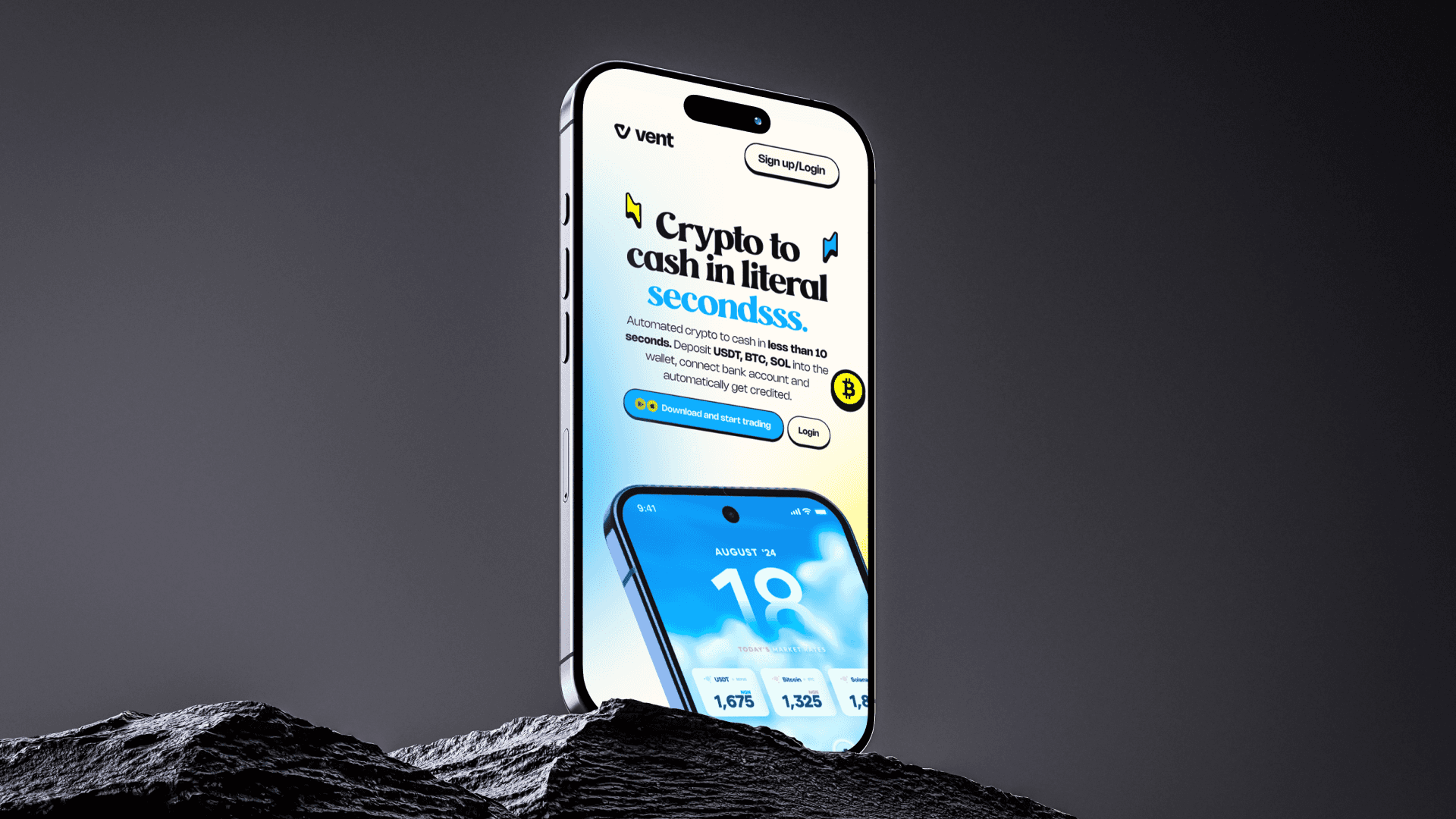
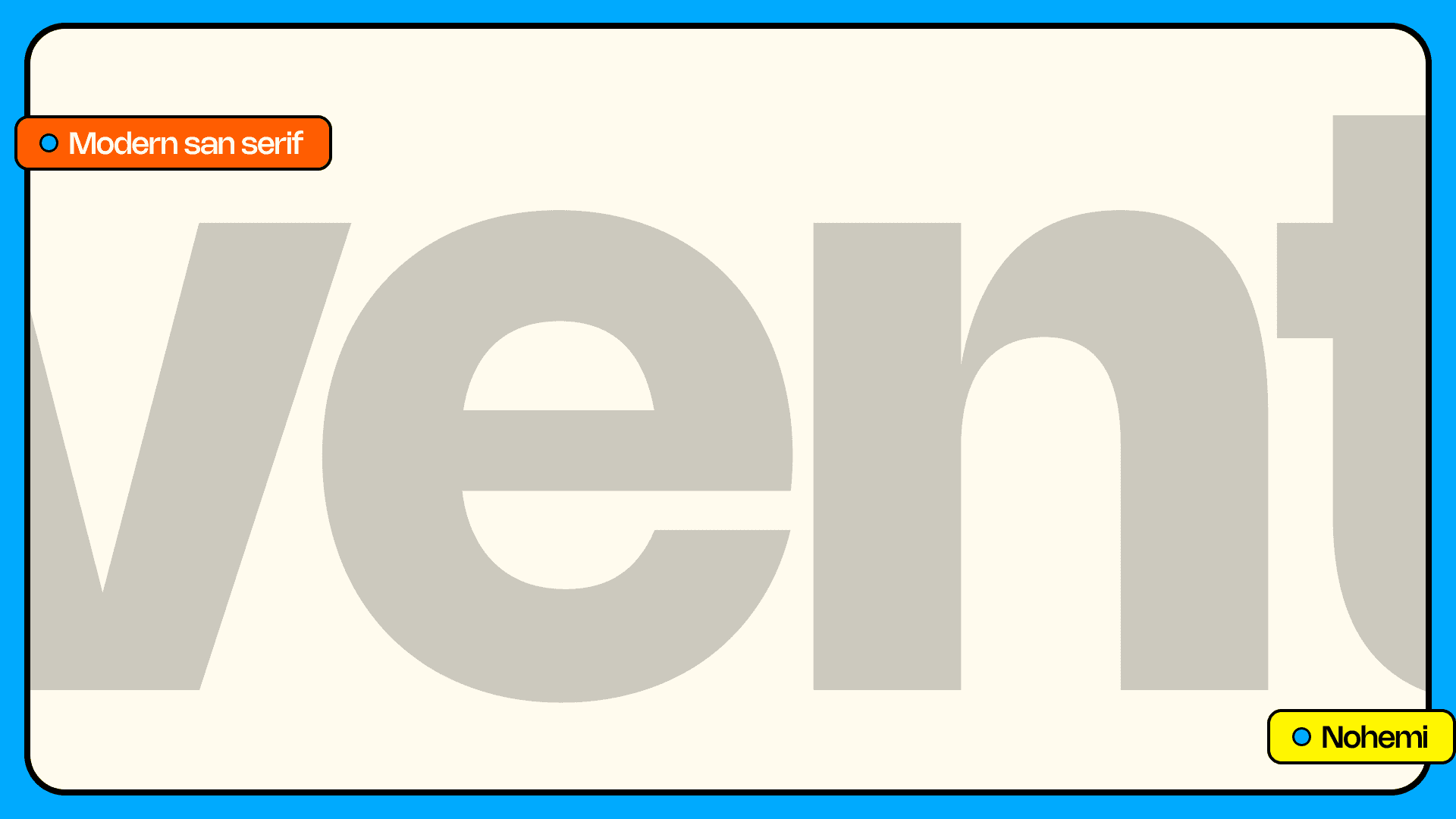
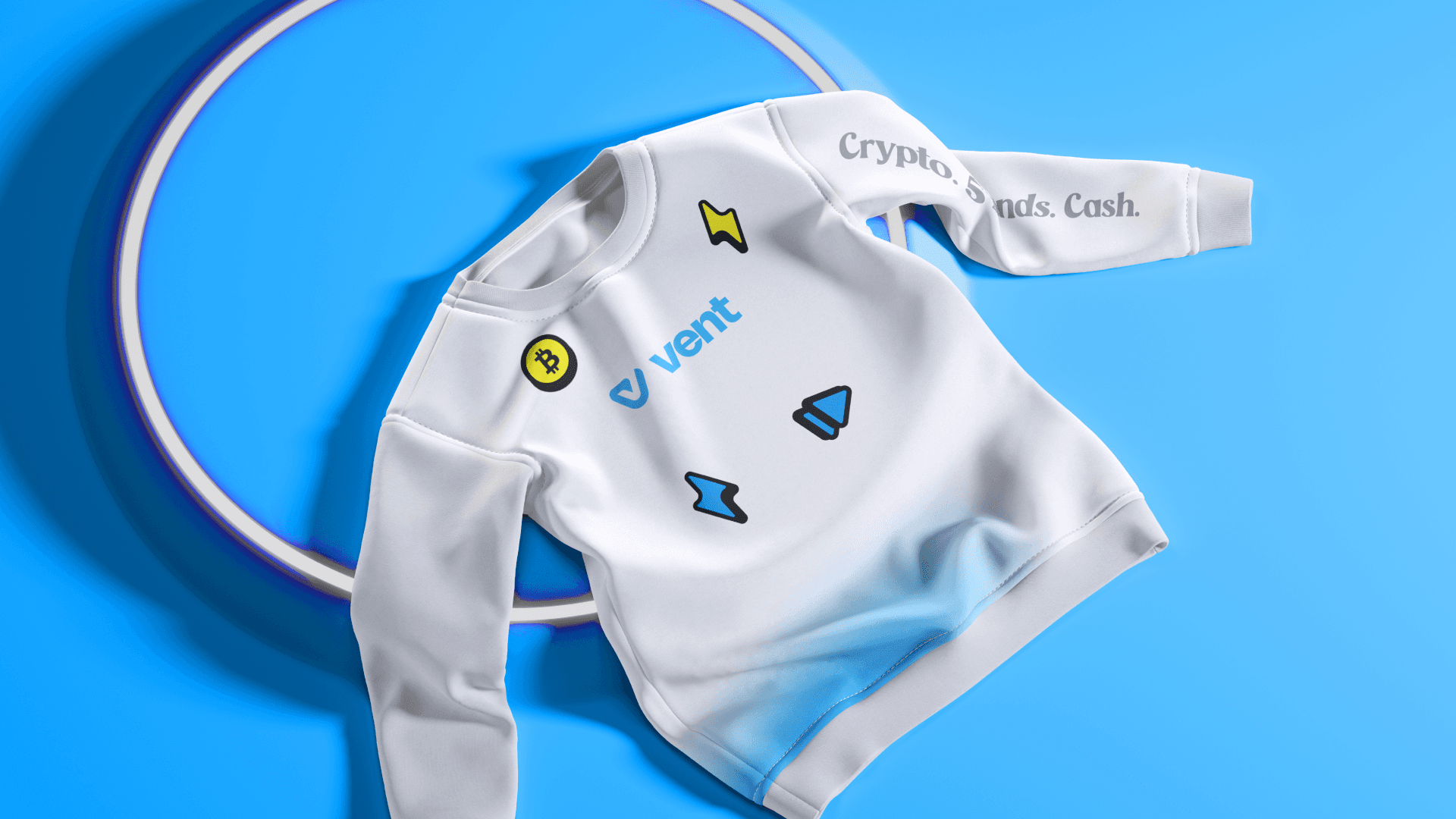
With a clear direction in place, the next phase focused on elevating the visuals. The color palette was tightened for better contrast and digital readability, giving the brand a sharper, more energetic feel. Typography was refreshed for improved legibility and consistency across formats. Small adjustments were made to the logo and supporting assets to ensure scalability and cohesion across touchpoints. Social templates, in-app visuals, and marketing materials were all realigned to reflect the refreshed identity. The result? A cleaner, more confident brand that looks as fast and reliable as the product it represents.
With a clear direction in place, the next phase focused on elevating the visuals. The color palette was tightened for better contrast and digital readability, giving the brand a sharper, more energetic feel. Typography was refreshed for improved legibility and consistency across formats. Small adjustments were made to the logo and supporting assets to ensure scalability and cohesion across touchpoints. Social templates, in-app visuals, and marketing materials were all realigned to reflect the refreshed identity. The result? A cleaner, more confident brand that looks as fast and reliable as the product it represents.


The Future of Creative Work? You Just Found It.
Ditch the chaos. Skip the back-and-forth.
Get a creative engine that runs like clockwork and delivers like a rocket.
Book a call